

Why is it more important than ever for developers today?
As of June 28, 2025, the European Accessibility Act came into force. It defines accessibility guidelines for web content and mobile applications at a European level and requires compliance from all SMEs (more than 10 employees or over €2 million in annual turnover).
But what does this term actually mean? It’s often used as a buzzword without being clearly explained in practice.
“Accessibility is the ability to make products, services, and digital content usable by anyone, in any context or situation.” – AGID
The key word in this definition is “anyone.” This includes every potential user, with particular attention to those who have “reduced or impaired sensory, motor, or cognitive abilities” (whether temporary or permanent). This group (~15–20% of users) is the main reason accessibility receives so much attention. However, it’s important to remember that the improvements made to enhance accessibility benefit every user’s experience.
Let’s look at a list of issues that may hinder the use of a mobile application:
- 👁️ Visual: blindness, low vision, color blindness, screen glare caused by external factors (e.g., sunlight).
- 👂 Hearing: deafness, hearing loss, inability to perceive audio information (e.g., noisy environments).
- 🦾 Motor: difficulty navigating and interacting with software in “standard” ways.
- 🧠 Cognitive or Psychological: dyslexia, attention deficits, memory issues.
How can I make my application accessible?
The only truly reliable way to ensure accessibility is to test your app with users who have different types and degrees of disabilities. However, there are tools and techniques developers can use to simulate or evaluate the user experience themselves.
Let’s explore some of them.
Font Size
One of the most common issues arises when a pixel-perfect UI clashes with increased system font sizes, smaller screens, or longer-than-expected text. In these cases, non-accessible widgets can easily overflow, hiding important content and creating barriers for many users.
You can test your app’s behavior by setting the system font size to approximately 200%.
- iOS: Settings > Accessibility > Display & Text Size > Larger Text → enable Larger Accessibility Sizes → set the slider near the maximum.
- Android: Settings > Accessibility > Display Size & Text → set Font Size to maximum (may vary).
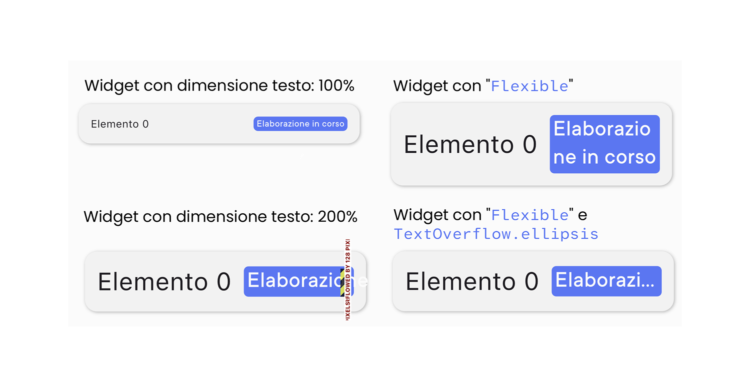
Once the font is large enough, try using the app and check which texts break the UI or get cut off. It’s important to test every screen and every possible state of each widget. Once you identify overflowing text widgets, there are two possible solutions:
Allow text to wrap onto multiple lines, increasing vertical space (preferred, as it ensures all users can read the full content). In practice, this can be done by wrapping the widget in a Flexible and optionally setting a maxLines parameter.
Set a maximum width and define overflow behavior (e.g., adding “…”) using overflow: TextOverflow.ellipsis.
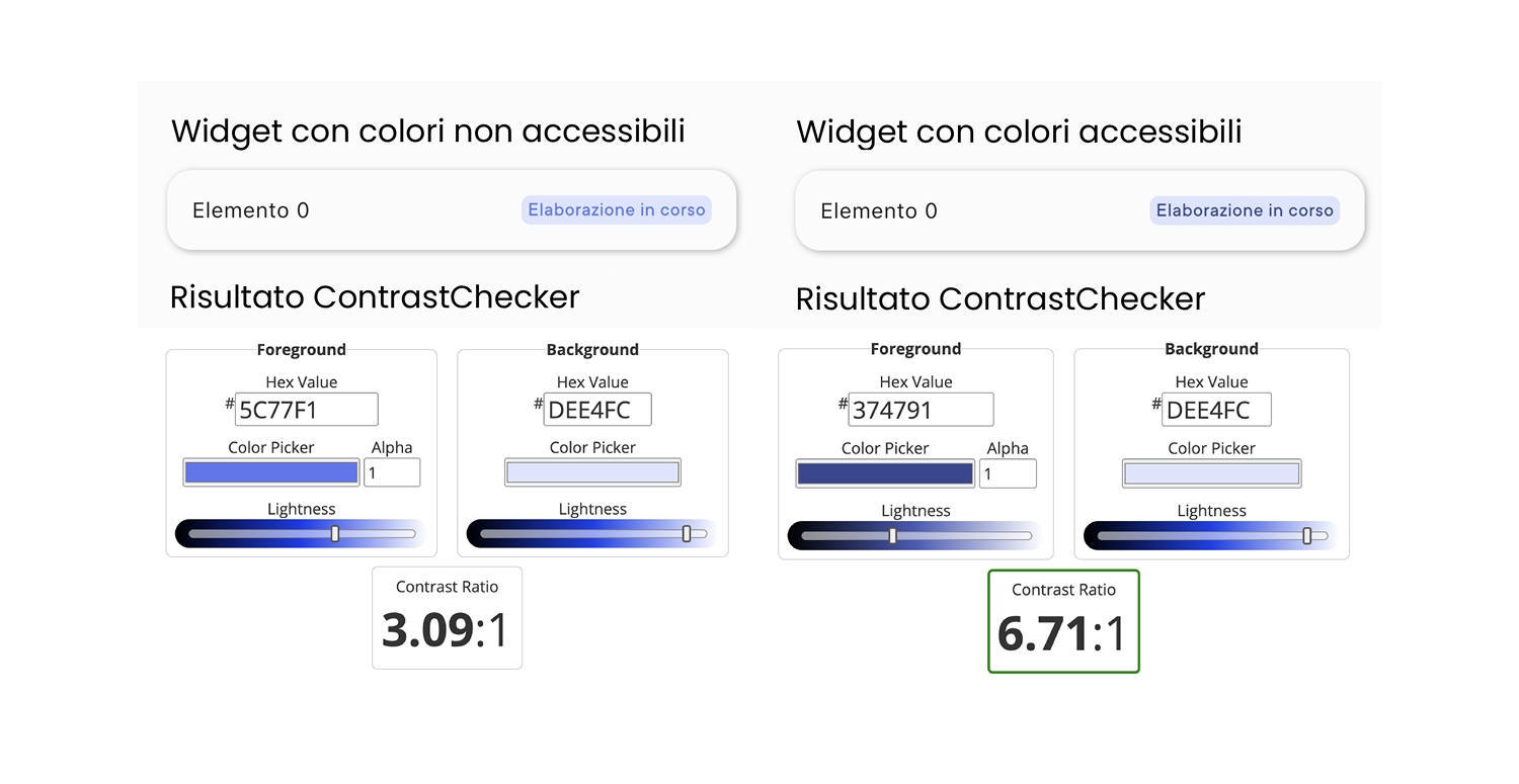
Color Contrast
Overlapping colors (especially text and background) must have sufficient contrast to ensure readability, even for users with visual impairments. Fortunately, color contrast can be calculated with a formula, and several tools (e.g., contrast checkers) are available to evaluate it.
Another way to test contrast is using the Android Accessibility Scanner. Once installed, it can be enabled in Accessibility settings, and by tapping its icon, it will analyze text contrast on the screen. The goal is to achieve a contrast ratio of at least 3:1 for large text 4.5:1 for standard text. Disabled UI elements are exempt.
Screen Reader Usage
Screen Readers are assistive technologies that interpret screen content and convert it into speech. Therefore, it’s essential that app elements are properly defined and interpretable.
Two main mobile Screen Readers can be used for testing: VoiceOver for iOS and TalkBack for Android. Both work similarly:
Navigate between elements by swiping left and right.
When an element is selected, its semantic meaning is read aloud.
Double tap to activate the selected element.
Another useful tool is enabling the showSemanticsDebugger parameter in MaterialApp. This removes UI visuals and displays only semantic labels that Screen Readers will read. When using Flutter’s default widgets, semantic roles are usually well defined. However, special attention is needed when creating custom widgets, as Screen Readers may not correctly interpret their meaning.
The Semantics widget allows you to describe the meaning of UI components. These descriptions form the Semantics Tree, which Screen Readers navigate.

Some key parameters include:
label (String): describes the widget, its state, or its action
(e.g., an edit icon described as “Edit item”)liveRegion (bool): notifies the reader when the widget changes
(e.g., a counter updated after user interaction)enabled (bool): indicates whether the widget is active
(e.g., submit button in an invalid form)toggled (bool): indicates whether a toggleable widget is active
(e.g., radio button)selected (bool): similar to toggled
(e.g., checkbox)button (bool): declares the widget as clickable
(e.g., a custom button)role (SemanticsRole): defines the role of the UI element
(e.g., tab, dialog, menu, status)
Additional semantic widgets include:
ExcludeSemantics: ignores non-essential elements
(e.g., background images)MergeSemantics: merges multiple related elements into one description
(e.g., label + description in a data list)BlockSemantics: ignores elements that follow within the same semantic container
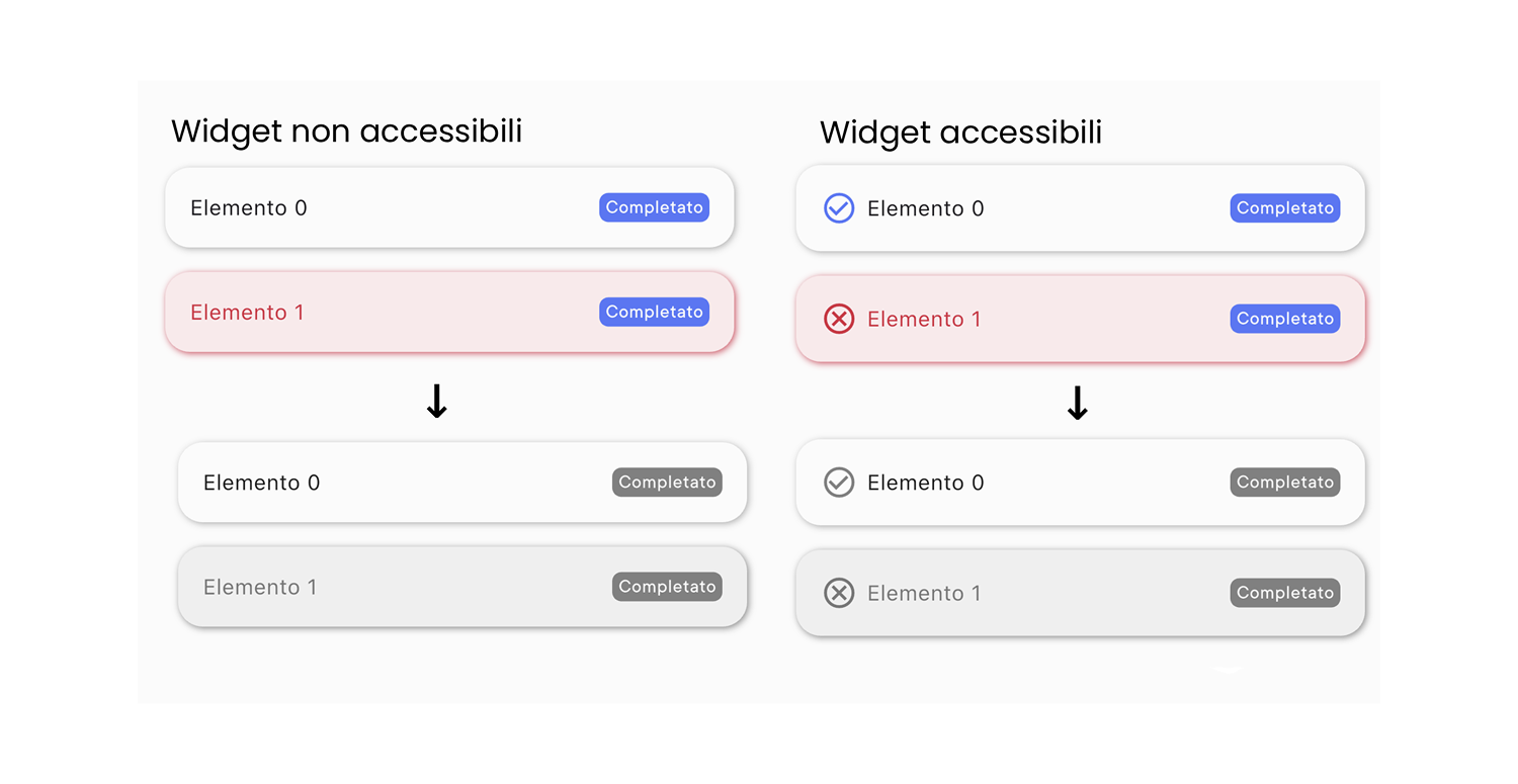
Use of Color
Information should never be conveyed solely through color. Set your device to grayscale mode and verify that no information is lost. A common example is using red/green to indicate error/success. While helpful for many users, it cannot be the only indicator. Adding icons (with proper semantic labels) is a good solution.
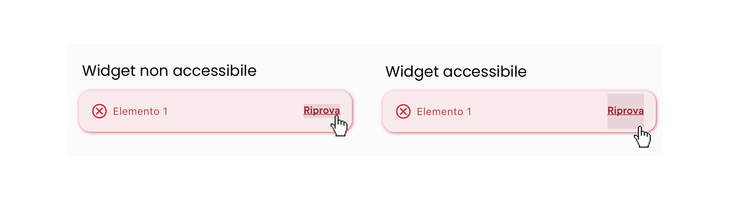
Clickable Areas
Clickable areas must be large enough for all users to interact with easily, and their interactivity must be visually clear. The Android Accessibility Scanner can flag interactive elements that are too small. According to WCAG 2.1, interactive elements should be at least 48px × 48px to be considered accessible.


